

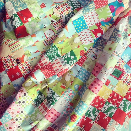
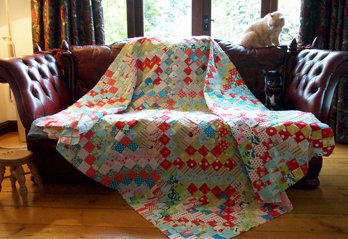
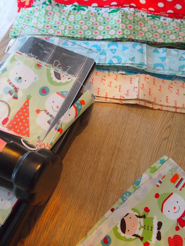
I've had a busy week this week! I finished my Christmas Scrappy Trips Around the World quilt top using the free tutorial from Quiltville and my Sizzix Bigz XL 2.5" strips die and I'm just waiting on some lovely soft flannel fabric to back it with before I send it off to be long arm quilted.
Quite often, on my blog, I get asked about how I choose my fabrics so I thought it would be an ideal blog post for here. To talk a little about the process of fabric selection and choosing colours.
My first step is to have an idea of how I want the finished quilt to look using a colour scheme. For this quilt my colour scheme was Christmassy, but without being too traditional. I wanted a fresh, colourful Christmas quilt, that was scrappy with a lot of different prints but without looking messy. If you follow a few basic rules it's quite easy to create that controlled scrappy look.
I started with Christmas fabrics I had to hand - and one print in particular gave me the the colour palette I was looking for. Using one fabric to help choose a colour scheme is a really useful way of shopping for more fabric or to help you pull suitable fabrics from your stash.
It can be overwhelming to decide colours without something to inspire you. Have a look through magazines or books, or around your house for something that grabs your eye and start to break that down into colours. Paint chips or colour cards from DIY stores are a great way to plan colour stories and to play around with colour combinations. Cut them up and store each of the same colour family in little zip lock bags so you can find the right colours easier - for example, all the greens in one bag, all the blues in another.
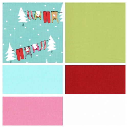
For this quilt the washing line print from Cherry Christmas was the perfect colour scheme. I already knew I wanted a more modern palette, not just red and green so the addition of pink and aqua was spot on. The white would help make the finished quilt look light and lift all the other colours.
My fabric stash is abundant with blues and greens, and I knew I would have plenty of fabrics to use without shopping for new ones (which is something you should also take in consideration - do you want to make a quilt using fabrics you already own, or are you prepared to go shopping?)
I've had a busy week this week! I finished my Christmas Scrappy Trips Around the World quilt top using the free tutorial from Quiltville and my Sizzix Bigz XL 2.5" strips die and I'm just waiting on some lovely soft flannel fabric to back it with before I send it off to be long arm quilted.
Quite often, on my blog, I get asked about how I choose my fabrics so I thought it would be an ideal blog post for here. To talk a little about the process of fabric selection and choosing colours.
My first step is to have an idea of how I want the finished quilt to look using a colour scheme. For this quilt my colour scheme was Christmassy, but without being too traditional. I wanted a fresh, colourful Christmas quilt, that was scrappy with a lot of different prints but without looking messy. If you follow a few basic rules it's quite easy to create that controlled scrappy look.
I started with Christmas fabrics I had to hand - and one print in particular gave me the the colour palette I was looking for. Using one fabric to help choose a colour scheme is a really useful way of shopping for more fabric or to help you pull suitable fabrics from your stash.
It can be overwhelming to decide colours without something to inspire you. Have a look through magazines or books, or around your house for something that grabs your eye and start to break that down into colours. Paint chips or colour cards from DIY stores are a great way to plan colour stories and to play around with colour combinations. Cut them up and store each of the same colour family in little zip lock bags so you can find the right colours easier - for example, all the greens in one bag, all the blues in another.
For this quilt the washing line print from Cherry Christmas was the perfect colour scheme. I already knew I wanted a more modern palette, not just red and green so the addition of pink and aqua was spot on. The white would help make the finished quilt look light and lift all the other colours.
My fabric stash is abundant with blues and greens, and I knew I would have plenty of fabrics to use without shopping for new ones (which is something you should also take in consideration - do you want to make a quilt using fabrics you already own, or are you prepared to go shopping?)
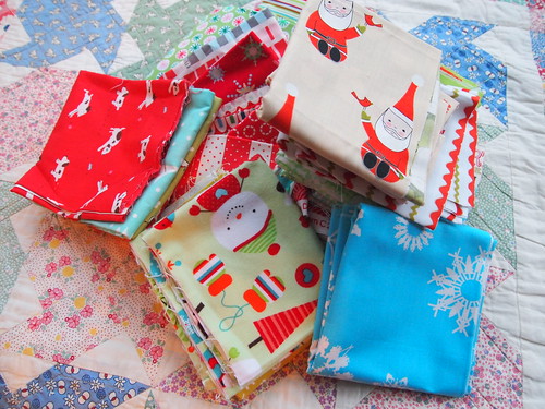
I pulled out as many Christmas fabrics I could find from my stash (and, as my friend is making the same quilt, from her stash too!) It's a good idea to pick out as many fabrics as possible. Too many. You can then sort them into piles and decide which ones work with your palette and which don't. I put a lot of fabrics away that were the wrong red or the wrong green.
Then I cut them into strips using my Bigz XL 2.5" strip die.
As well as Christmas fabrics I chose fabrics that had small scale prints or were tonal prints that are often known as 'blenders' - like dots, stripes and small florals, in the same colour scheme. Small scale prints represent their colours better than larger scale prints - you may find a print with a large floral on that looks like one colour overall, but when you cut it into small pieces the individual pieces can read as a whole rainbow of colours. As an example, the Christmas print on the Big Shot in the picture above reads as green but when cut into small squares depending on what part of the design you get it could read as white, red, green, or even blue.
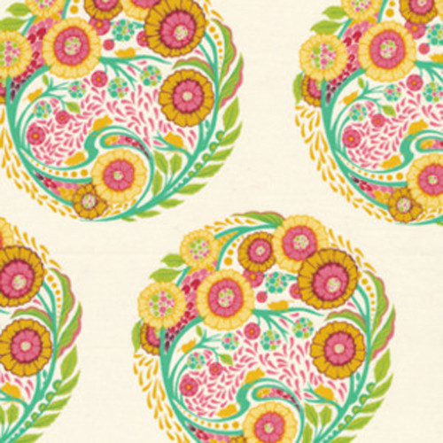
The print below is an example of what isn't a good choice. The large medallion is made up of too many colours, and there's too much neutral background that will dilute the overall effect. Although technically this print contains most of the right colours for the palette, it's just too busy and the scale is too large.
On the other hand, small dots are particularly good because they tend to be single colours, so you can use them to add cohesion and to pull fabrics that are busier into the colour scheme and calm something very busy down a little. Also, the whole print is the same - however which way you cut, you will always end up with the same thing. If you are still a little wary of using too many fabrics (there are over 100 different prints in my Christmas quilt, of which around half are Christmas fabrics) then try adding some solid fabrics from your chosen colour scheme. Solids give your eyes a place to rest, and there are so many to choose from that you don't need to just rely on basics like white, black or grey.
Quilt fabric manufacturers design fabrics specifically for this job of adding cohesion or 'blending' fabrics together. They may not be the most exciting looking fabrics in a store, but they're your stash building essentials and every quilt will use them.

In a nutshell this is what you need to remember when choosing fabrics;
1. find a colour scheme either by selecting a particular fabric, a picture from a magazine, paint chips, or something in your house.
2. select fabrics that fall within that scheme
3. it is always best to choose too many fabrics and 'audition' them, before deciding they might be the wrong scale/shade/print type
4. use coloured solids, or blenders such as small scale dots to add cohesion and tie your palette together
5. the more fabrics you use, the scrappier or busier the overall look will become. Consider this when selecting fabrics. How busy do you want the quilt to look? Do you like it to be scrappy? Do you want to go shopping for more fabric, or use what you have on hand?
I really hope this helps you select fabrics for your next project and to try something a little different. It's always fun to experiment and try out new colour palettes instead of the ones we feel most comfortable with.
Next week I'll be showing you how to use the drunkards path dies to make a cushion cover.
Great advice, thx! I will definitely be back for the drunkards path advice, i really need to get on with using mine for my Craftsy 2012 block, oops! : )
ReplyDeleteWonderful post, thank you!!
ReplyDeleteI am always using the same colours! Thanks for the good advice
ReplyDeleteThanks for the informative post. I have learned a lot. Di x
ReplyDeleteSmashing advice x
ReplyDeleteFab post Katy!
ReplyDelete