Hi,it's great to see you again!
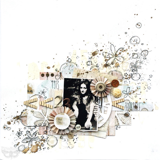
From time to time it is good to have some white space on your project - to give some air, some space to "breathe", balance to the composition... but what can ve do to make the white space less boring, less plain? How about some gesso and a home made, Sizzix die-based stencil technique? This is what I did to the project below:

In the background you can see white alphabet pattern, done with gesso applied through the leftover from cutting one of Tim Holtz alphabets. It gives just a bit of thecture, delicant element to the composition. More visible are elements gathered close to the photo - paper rosettes and a picture wheel, which is layered directly under the photo.
Here are the dies numbers:
- 658558Sizzix Bigz Die - Picture Wheel
- 657177Sizzix Sizzlits Decorative Strip Die - Mini Paper Rosettes (2 Sizes)
Having these elements on the project you don't that many embellishments anymore = no flowers, no lace is needed!
I finished the project just with paper, epoxy stickers, wood elements and metal breads and establishments - Mechanicals (all from Prima). Free hand pencil doodling going perfectly with the pattern on papers and some thread give the project modern, artistic look.
I hope you found some inspiration - Sizzix provides so many elements to choose from that embellishments on your projects can be really reduced to minimum... the imagination is the limit!
xoxox
Finn


No comments:
Post a Comment